Initial Photoshoot
What?
|
How?
|


Initial Photo-shoot Analysis
LED Light Strings:
I like the effect that the shutter speed has created with these lights. I like them because they have created abstract twists and shapes which when the photo is more zoomed in looks as though they've been layered over the background image. I think the images that have been the most effective at capturing the light's motion are pictures 10, 24 and 26. These images have captured full twists and create a good contrast with the bold vibrant colours against the dark and dim coloured background.
Light Writing - Stripes:
The two photos I've captured of the stripes light writing have a minimalistic effect and a good contrast against the black background. That's the only light drawing i could capture because I didn't have my tripod so if I had had a slower shutter speed there would've been too much shake to capture the desired effect. However, I do like the minimalistic effect my camera has captured because the light is subtle and effective.
Ladies With Lit-up Dresses:
I like the first picture of the ladies with the lit up dresses because I feel as though the lighting in the photo is effective and highlights their features and contours well. I also like the second picture as the use of the slower shutter speed on my camera creates the movement in the picture well and blends the colours of the ladies’ dresses well.
Coloured Light Bulbs
From the coloured lights photographs I like the third image because the use of the slow exposure and my downward movement creates a curtain of colour effect that makes the bulbs more interesting. This is also shown on the twelfth image but the photo is more zoomed in so doesn't show the movement of the people in the environment which helps the viewer to find the focal point of the image. I also like the seventh image because the subtle movement makes the bulbs have a sort of UFO effect with the slow exposure. I also like the created movement in the fourteenth photo as it’s more abstract and the movement creates a blend of colours which each bulb. Finally, I like the fifteenth photo because the vibrancy of the red lighting in contrast with the dark shadows in the photo make the photo interesting and effective.
Coloured Light Drawings
From this photo-shoot I like images; 1, 2, 8, 11, 14 and 20. I really like the effect of the first image, I feel the lines from the movement I created with the slow shutter speed resemble the shapes from the northern lights or how the lighting is placed within a church or cathedral. I also like the second picture because the colours and movement within this image make me picture moving traffic on a busy road. I like the contrasting colours of the lights in this image. In the 8th image I like how the colours have created a gradient within the time frame of the shutter speed and I like the shapes I’ve created with the movement of my camera. To continue I like images 11 and 14 because they have created scale-like patterns and I like the different colour schemes in both photos. Finally, I like image 20 because the shapes I have created have a strong geometric shape and I like how the lines and colours have blended into each other and the vibrancy of colour within this photo.
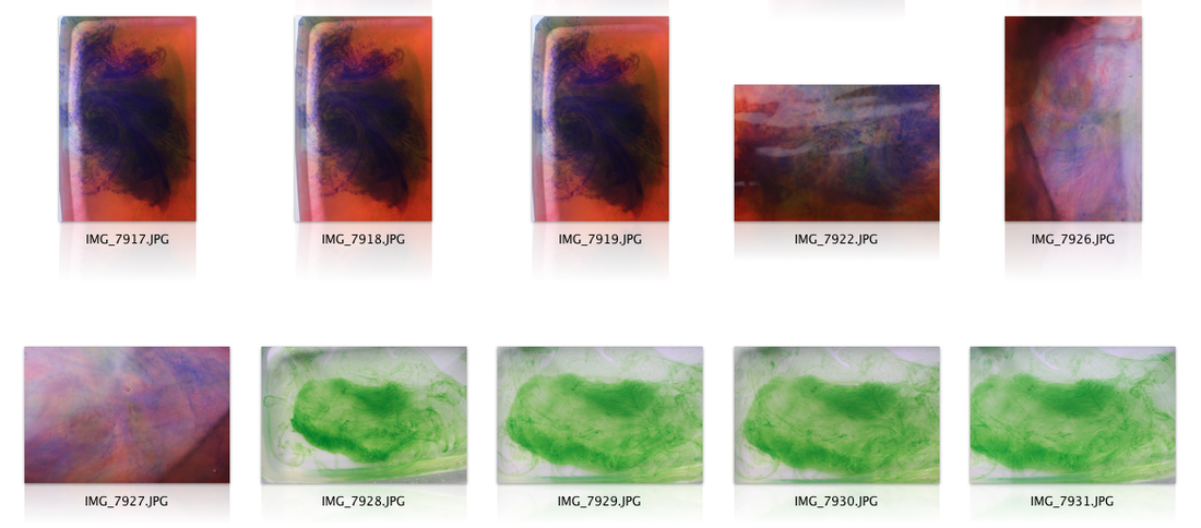
Smoke photography
I like the first image from my smoke photography as I like shape the incense has created. However the colour of the background doesn’t represent the shapes of the smoke very well so I will edit the colours within the photo to emphasise the smoke more.
Water and Ink Photos
I feel as though my first five pictures featuring the fast shutter speed of the water droplets in the blue vase weren’t as successful as I had intended as the lighting wasn’t right and the effect of the water wasn’t very interesting. However I like the third and fifth image from the brusho ink and water. I like the shapes the ink splashes have created in the water as well the pigments of the colours contrasting with each other. Moreover, I set up my tripod wonky therefore the pictures aren’t well aligned so I would straighten the photo in Photoshop.
Edited Photos From My Initial Photoshoot
Second Photo-shoot
What?
|
How?
|
Second Photo-shoot
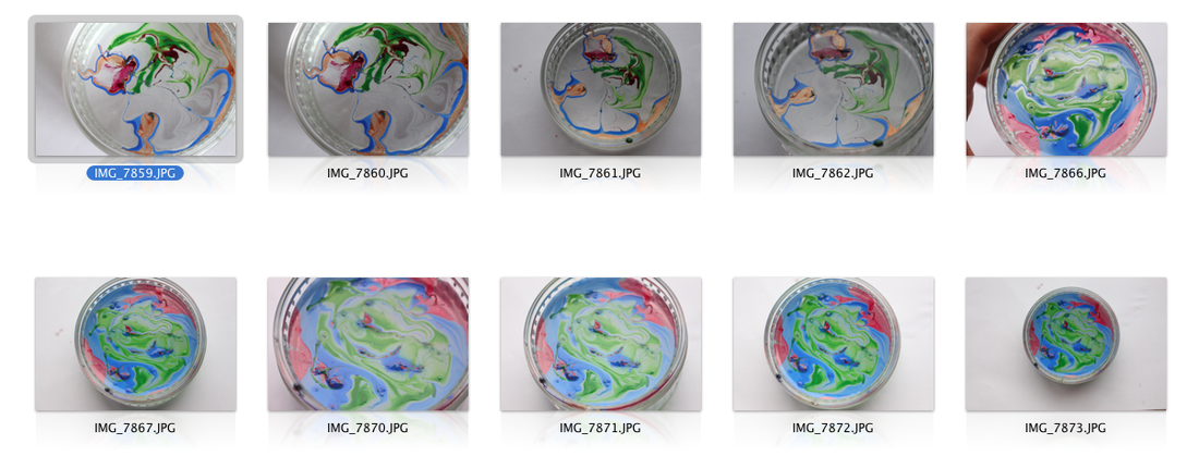
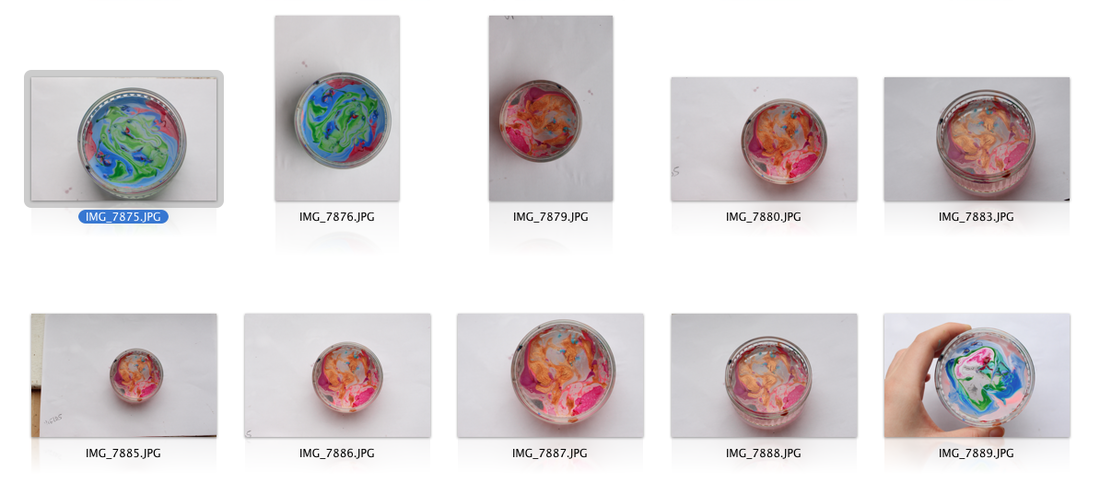
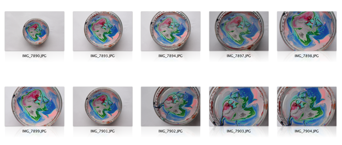
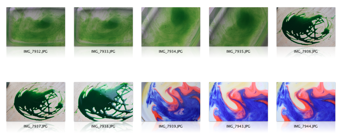
Photo-shoot of the nail polish on water
I like the effect of IMG_7873 because I like the composition of the circular bowl being in the middle of the image. I like the texture the nail polish has created on top of the water. In IMG_7866 it’s clearer to see the shapes I have created in the water with the nail polish droplets. I like the colours of nail polish I have used because they contrast well so make the patterns and textures more interesting.
I like IMG_7887 because the tones of the colours work really well and the shapes and textures of the nail polish are abstract and link well to my psychedelic themes. For IMG_7890, like with IMG_7873, the composition of the circular bowl in the centre makes the patterns and colours I’ve created with the nail polish look more eye-catching.
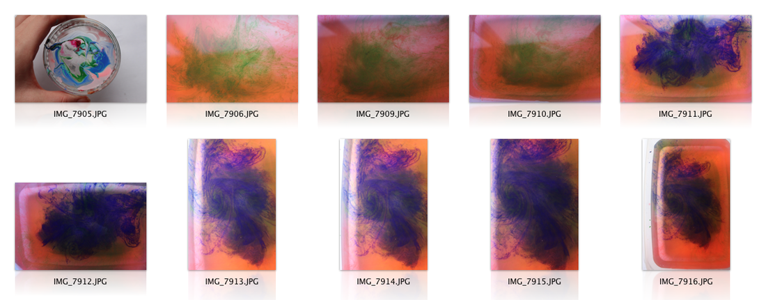
Ink and Water
For the photos I’ve done with ink in water, I like IMG_7911. I feel as though the shapes created with the purple ink in IMG_7911 are effective because they almost create reflected shapes which links well to Tame Impala’s artwork. I also like how the cool tones of the purple contrast with the warm tones in the background. The other photos I created with the ink and the water weren’t very effective as the tones of the colours I used were too similar and didn’t create the abstract shapes I was looking for. I also feel as though there was too much reflection from the lighting I used against the water that washed out the colour of the inks.
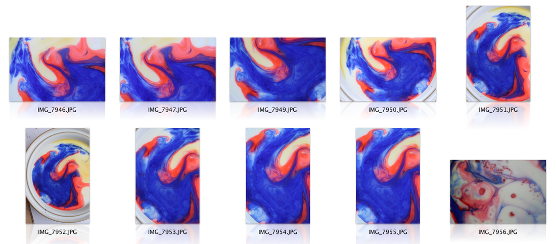
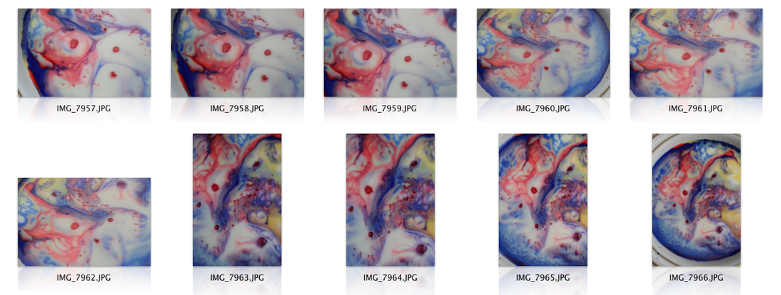
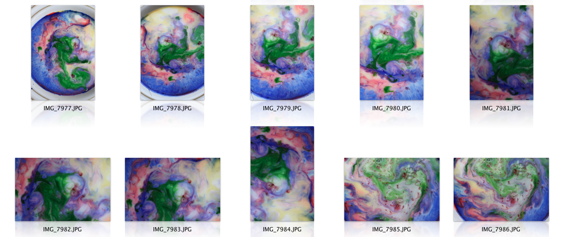
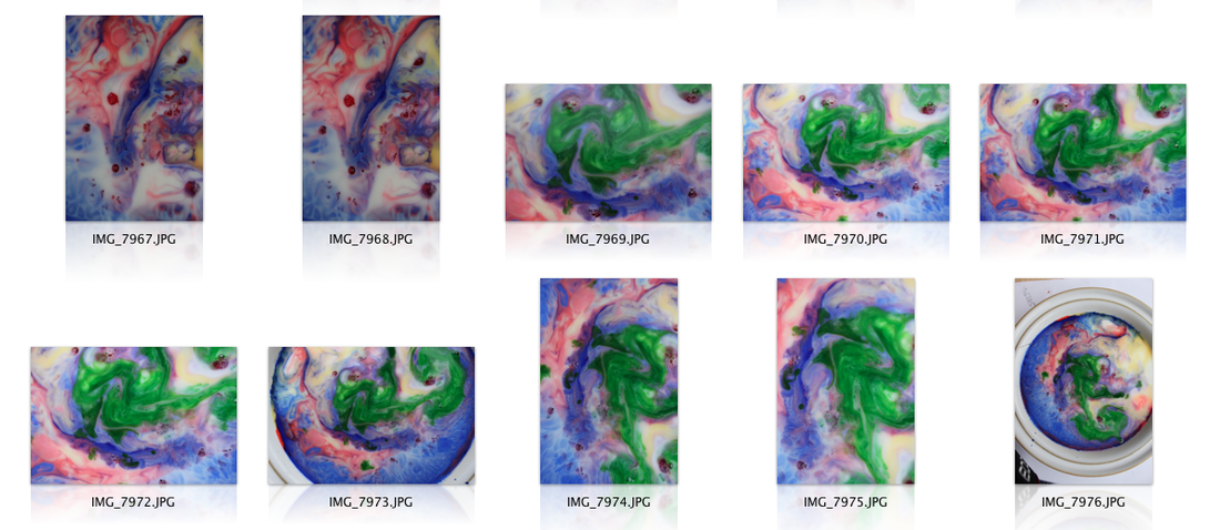
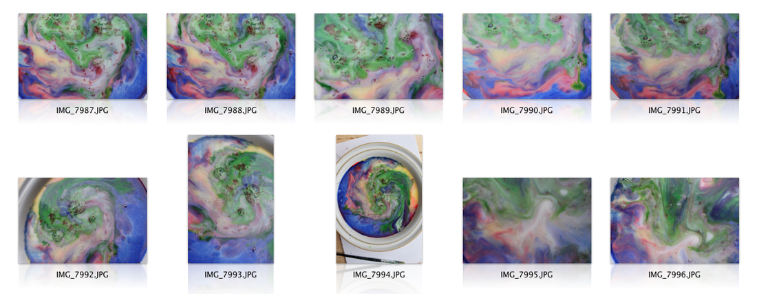
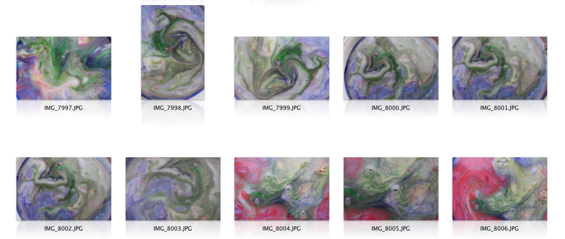
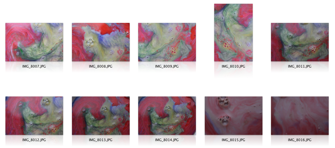
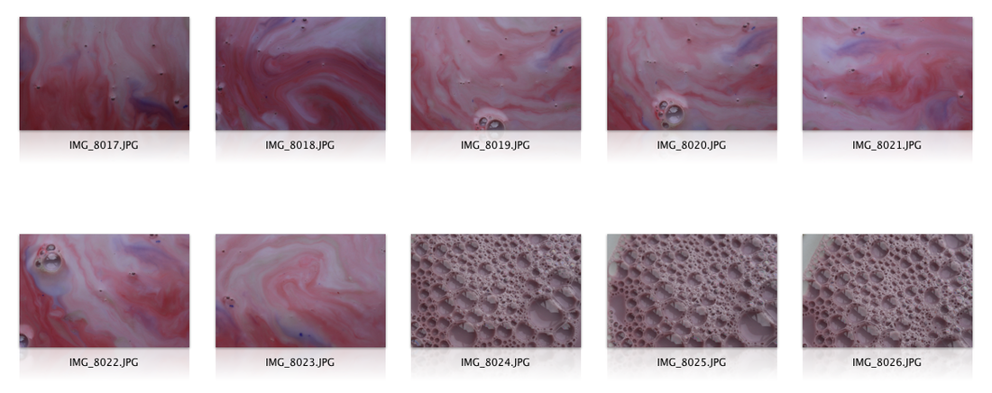
Ink, Milk and Washing-up Liquid
From my images with ink milk and washing up liquid, I particularly like images IMG7963, IMG7971, IMG7976, IMG7981, IMG7986, IMG7994, IMG8006, IMG8008 and IMG8022. I particularly like IMG7963 because the patterns the washing up liquid has created in the milk and the ink are interesting and look similar to a lightning storm. I also think the colours work really well with the contrast of the white of the milk. I also really like IMG7971 because the way the colours of the ink have flowed together to create a marble effect in the milk works really well. I like the vibrancy of the green against the other colours. I feel as though IMG7976 has created a good composition with the way I’ve photographed the bowl along with the all the elements created with the inks and the milk. I feel as though this image really captures all the colours and how well they all assemble together and creates almost a Monet-type of painting. The interesting aspects of IMG7981 are that the vibrancy of the colours in this photo has created a gradient effect. I like how the vibrancy of the colours increases further down the photo. To continue, I like the speckles the washing up liquid has created in IMG7986. I like how the red speckles have created a contrasting boldness of colour compared to the rest of the photo. Similarly with IMG7976, the compositions of IMG7994 work well with the central focus on the bowl. I also like the movements and colours of the inks with the milk and washing-up liquid. With IMG8006, I like how the colours are all contrasting with each but blend well with each other because the colours are all washed out. Furthermore, IMG8008 is one of my favourites because the intensity of the red against the other colours makes the photo really eye-catching. Finally, I like IMG8022 because the colour scheme of the pinks and the reds makes me think of ice cream and I feel as though that adds an interest to the photo.
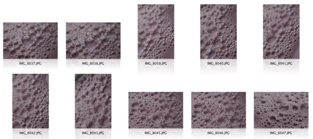
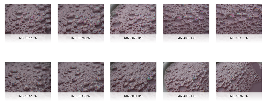
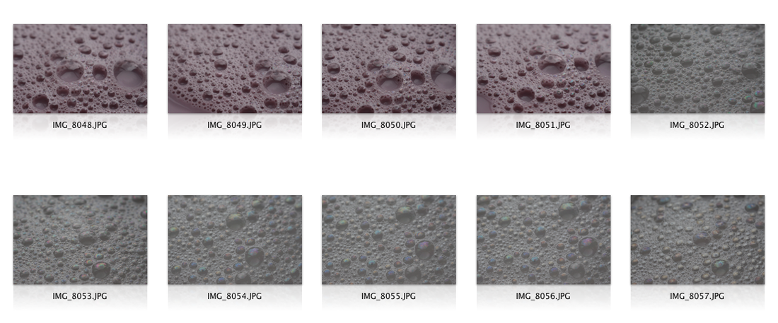
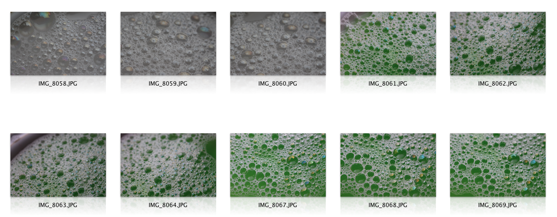
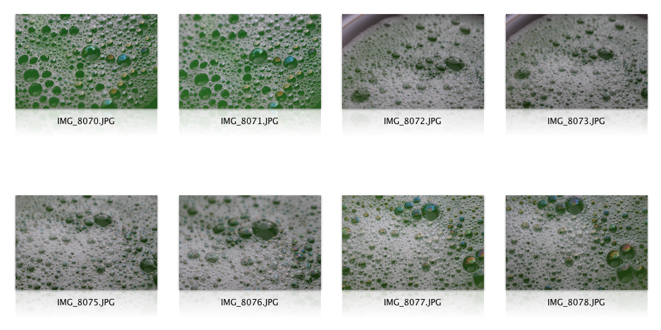
Bubbles
From this section of the photo shoot I particularly like IMG8037, I like the way the lighting has captured the oil spill effect on one of the bubbles in the photo. I also like the smoothness of the oink colour in this photo. To continue, another photo that stands out would be IMG8028, this is because the aperture in this image works well for the bubbles and how it has focused on the forefront bubbles as opposed the those further back. This works well because the photo then highlights the more prominent bubbles and details the oil effect further. In IMG8058, I feel as though the colours in the image create a nice soft effect and focuses more on how the lighting focuses on the bubbles which adds to the details within the photo. The use of the green coloured water in IMG8071 works well because it has altered the colours of individual bubbles in this image which adds an interesting effect to the photo. Finally, IMG8076 also works well in this photo shoot because the uses of the shaken bubbles have created a nice white texture that symbolises that of clouds or cotton. I do also like how this then highlights the larger bubbles and their dome effects.
